6 marketing own goals of 2015
12 January 2015 By Northern Lights

 I know. We aren’t even two weeks into the New Year. Maybe it’s that post-holiday feeling, but in the last ten days I have found myself commenting on several poor marketing initiatives. It’s made me reflect on our own marketing activities – are we making similar clangers? What can we learn from these?
Here I share what has hit me
1. Videos with much too long intros
When you go onto a video clip, what do you want to see? The content. Someone speaking or demonstrating, giving useful information. Not a 10 second music intro? Why do companies let designers take over production? It may look good when presented in the boardroom but you have to imagine people surfing, clicking on their mobile with a poor signal. Videos these days need to get straight to the point.
2. Email invitations when the sender is out of the office
We are members of an organisation which has started sending Outlook invitations to all its members for all its events. It sounds a good idea in theory – if you want to go, then all the details go straight to your calendar.
But I wasn’t going to be in the country for the three latest invitations so I rejected them – and then got a response “I am out of the office because of ill health…” etc.
I received a marketing email from another organisation and this one interested me. I replied immediately with a question or comment – only to get another “out of office” reply.
The lesson – if you are going to do an emailing campaign, make sure someone is there for the replies?
3. Advertising that can never deliver
Like most business people with an office in Yorkshire, I regularly use East Coast rail to London. It’s fast and pretty much on time. Comfortable it is not. Even First Class is hardly roomy.
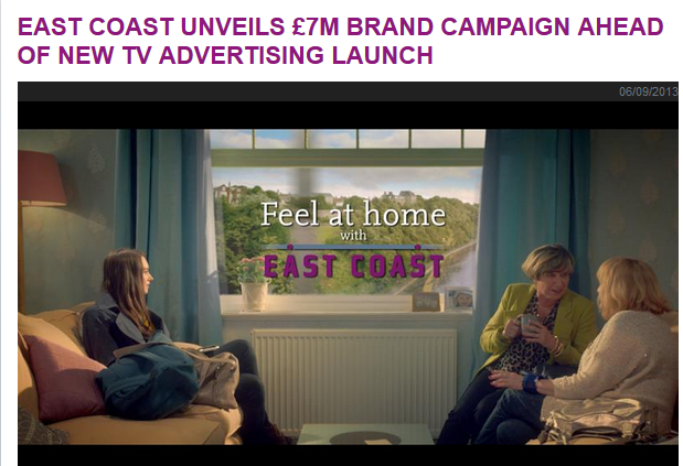
So the East Coast £7m advertising campaign, Feel at Home can never do anything but raise expectations and then disappoint. Look at the photo below – squishy seats, room to put your handbag down, a coffee table in the middle, coffee in a china mug, plant pot and pictures on the window sill. I am sure you don’t need me to describe the reality.
The truth is, I’m generally OK with what they offer – you can get to London in less than 2 hours and while it may expensive, it will do. But suggesting it is like being at home …
They are setting themselves up for failure.
4. Web advertising tracking and targeting
I have long disliked the way that websites use cookies to insert ads of what you have been looking at into other websites. It feels intrusive and aggressive.
But last week I was drawn into clicking on one of the images only to find, a bit like the email “out of office”, that the item was out of stock.
I’d rather not be targeted, but being shoddily targeted is even worse?
5. Website with entire product range sold out
I wonder what your views are on this one?
I was looking for a leather album as a 21st birthday present. I went onto one website and clicked on the journals.
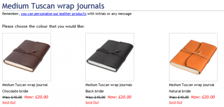
This went through to leather journals – click. Then Tuscan wrap journals – click. Then the different coloured journals – click. Then you get this below – sold out. And I clicked for ten minutes – and couldn’t find a single album to buy. Everything sold out.
Apart from having to make three clicks through to the product, would it not be better to say upfront at the start of the website, “all our albums are sold out, new stock in 6 weeks” or whatever? I couldn’t help thinking a web designer was wanting to keep people on the site for their own targets – but certainly in my case, I will never try to buy anything here again. Massive waste of time?
6. Product descriptions – can they deliver?
Actually this one amused rather than irritated! A lovely client sent our team a fabulous box of chocolates, from a Continental range.
 I just loved the descriptions – take this one for the Alpini chocolate, “The view of snow-capped Alps from the green meadows below fill even the locals with awe and inspires this hazelnut and almond praline sprinkled with finely grated white chocolate”.
This will set us all up for the year ahead!
(I should say the photo isn’t of the Alpini – they had all gone by the time I took the photo!)
Have you spotted any marketing that didn’t really work? Am I being grumpy with these examples?!


